The Design of Everyday Things

Trying something new  and will ‘review’ a book for this post. I recently read ‘The Design of Everyday Things‘ by Don Norman and  really enjoyed it. My intent in reading  was to level up my design skills and gain empathy for how designers think about problems and solutions. In reading the book I realized it contains many lessons for Product Managers and I’ll detail the ones I found most valuable here.

The Psychopathology of Everyday Things 

‘Great designers produce pleasurable experiences’ is how Norman opens this chapter. Here he sets the tone that design isn’t just how something looks, but how people remember their interaction. If it’s positive, there’s a good chance they’ll come back to use your product. And here we’re introduced to the fundamental principles of design that will enable these pleasurable experiences (some examples from the book, some my own).

  • Discoverability -figuring out what actions are possible
    • Results from the next five principles
  • Affordances – a relationship between properties of an object and the capabilities of the actor that determine how the object can be used
    • Example: A chair ‘affords’ (‘is for’) support and affords sitting
  • Signifiers -ensuring discoverability of how to use/what to do
    • Example: think of a carousel of photos in an iOS app with the small indicator dots (page controls)
  • Constraints – guide actions and ease interpretation; can be physical, logical, semantic, cultural
    • Example: The door to your home has the physical constraint of only allowing keys to be entered in a certain orientation
  • Mappings -relationship between controls and their actions
    • Example: an automobile seat control that is the same shape as the seat – push up to move the seat up, push back to move the seat back, etc.
  • Feedback – continuous information about the results of actions performed
    • Example: a loading indicator on a web page/app after you click a  buy button and then a confirmation dialog
  • Conceptual Model – providing the information needed to project understanding and  a feeling of control; can often be inferred from the device itself
    • Example: a pair of scissors; the holes are there to put something into- their size indicate it can only be fingers; the blades are sharp and clearly not for holding

Keep these in mind next time you sit down for a design review with the team. Instead of asking to make the button bigger, consider how these principles are used or not used. And maybe suggest improvements to make them stronger.

The Psychology of Everyday Actions

This chapter is concerned with how People are able to figure out what to do with technology and what happens when things go wrong. Norman provides the Seven Stages of Action as a framework for what’s going through a user’s head as they interact with a product. He also groups these actions by whether they help answer questions of execution (feedforward, #1-4) or whether they hep answer questions of what has happened (feedback, #5-7) They are:

  1. What do I want to accomplish?
  2. What are the alternative action sequences?
  3. What action can I do now?
  4. How do I do it?
  5. What happened?
  6. What does it mean?
  7. Is this okay? Have I accomplished my goal?

He places the burden on the designer to make sure the product provides the information necessary to answer each question. This ties back nicely with the fundamental principles  as each of them can be used to answer a user’s question as they progress through the Seven Stages of Action.

We’ve all been in work situations where we attribute poor reviews to ‘user-error’ or say designs are good enough because ‘people will just figure it out.’ We do this to absolve ourselves of the responsibility and this drives Norman nuts. He says these ‘errors’ are more often than not a result of poor design and should really be called ‘system error.’ Human errors will occur and designers should anticipate them; using the fundamental principles is key in minimizing these errors. And when errors do occur, because they will, the errors should be as cost-free as possible.

Human Error? No, Bad Design

Norman furthers the error minimization argument by discussing the relationship between Humans and Technology. Humans are versatile and creative while Technology is rigid and precise; their collaboration can be a beautiful thing. He illustrates this with a Human + Calculator collaboration – humans figure out what’s worth solving and the calculator can precisely produce the solution. This reminds be a bit of the ‘Steve Jobs bicycle quote,’ where he calls the computer a bicycle for our mind. It heightens human performance to levels never known (Norman actually worked for Apple).

Difficulty occurs, however, when we don’t think of humans and technology as collaborators. Norman says this that this ends up requiring humans to behave in machine-like fashion by doing things like monitoring machines or repeatedly performing actions that require great precision. And when humans fail at these tasks, they are blamed for them. Errors will occur, but design should anticipate these and make them as inconsequential as possible. His principles for dealing with errors are:

  • The knowledge required to operate technology should be knowledge in the world – this is NOT the knowledge acquired by extensive teaching or practice; think of the iPhone touch-screen keyboard. When introduced, people were already accustomed to the location of letters on a physical keyboard so this didn’t require specialized knowledge
  • Use the power of natural and artificial constraints to ‘force’ humans into performing the correct action
  • Make things visible for both execution and evaluation – make it apparent what actions can be performed (feedforward) and clearly communicate results of what happened (feedback)

Design Thinking

I read the Revised and Expanded Edition so I don’t think this chapter was covered in the original, but I’m glad Norman added it. He discusses best-practices such as defining problems before designing solutions, double-diamond model of design and human-centered design process. But he then quickly turns around and says that real world contexts don’t allow for any of this! Norman gives an anecdote of how a designer told him there are only two scenarios in which new products are actually introduced at their company: 1) adding features to match competition and 2) adding features driven by some new technology

I think many of us working on Product Teams can relate. Norman says that market-driven pressures and an engineering-driven company drive us toward more features, complexity and confusion. And even companies that do try to solve for customer needs run into problems like insufficient time or insufficient money that thwart their efforts.

So what can one do when faced with this reality? Norman writes that the only way to avoid the crunch that prevents the ability to do good up-front design research is to separate that process from the product team (I assume he means separate from development cycles). He argues to always have researchers out in the field studying potential customers and products and then when an initiative is green-lit, designers already have recommendations. I interpret this idea from Norman as  Product Discovery, which has been written about in great detail by Marty Cagan and Teresa Torres. It’s a continuous, non-linear process that requires you to engage with your customers and understand their problems and present solutions in a quick and cheap manner. Product Discovery can be an antidote to the market pressures and feature factories because you’re constantly validating with customers and know what will stick and what won’t. You then use the results of this discovery to prioritize the biggest opportunities and push back on requests that might just be noise (always easier said than done).

Design In the World of Business

Norman starts this chapter by talking about something I’ve constantly grappled with in my Product career – ‘featuritis.’ Featuritis is the continual addition of features, even if the product is already successful and useful to customers. Norman writes ‘..it is rare the organization that is content to let a good product stay untouched.’ There is always the urge to keep building in any type of business environment, even if there’s no clear customer value in doing so. I think a lot of this comes from an engineering mindset where people just want to keep building and use the salaries paid to developers to justify this.

What can one do? A couple things I’ve tried to do to mitigate this are 1) remove features that aren’t performing if you are going to add more and 2) use learnings in Product Discovery to at least focus on the right problems to address if adding new features. Norman offers some help by citing Harvard Professor Yougme Moon’s book, Differentwhere she argues to double-down on strengths instead of matching feature by feature or ‘competition-driven design.’ If you are to build, build on what you are good at and ignore the irrelevant weaknesses. Norman writes that this  requires support and understanding from your Leadership, but in my experience you cannot just wait for that to happen. I believe Product Teams need to ‘manage up’ and educate Leadership on these issues. Knowing your customers and your product metrics will help in telling your story.

The Moral Obligations of Design

Morality of design is a hot issue as 2018 draws to a close. Norman laments the use of design to promote superfluous consumption of objects, he writes ‘we are surrounded by objects of desire, not objects of use.’  I wonder what he’d say about products that ask for our constant attention and use our personal data in return for providing a feeling of connectedness among other things? He offers no easy solutions and I don’t expect any. He’s simply laying out the reality that readers of his book will face as they try to put his lessons into practice.

Thinking About Design

Norman concludes that the complexity and difficulty of Product Development are what makes it so rewarding. Yes, designers need to make things that satisfy people’s needs, but design in only successful if the final product is successful. This means having to work within engineering constraints so the design can be created on time; this means working with marketing to make sure you also design something that people actually want to buy; this means providing assistance to customers when they become confused about the product. Product Development is complex and  it requires technical, business and personal skills to be able to work with so many parties and satisfy their requirements. Norman says there will be peaks and valleys throughout the process, but great products overcome the low and end up high.

And Norman reminds us to fight for and appreciate great design! Designers should fight for better usability and consumers should tell manufacturers about products with poor usability. Think about battles fought to make sure your favorite products shipped with good design; think kindly of the people that made sure it happened.


Scroll and Timing


Last week on Twitter I read that Union Square Ventures was leading a round of funding for a company called Scroll. I’d never heard of Scroll (it hasn’t officially launched), but after reading USV’s announcement I can’t stop thinking about them.  Scroll will sell ad-free, subscription-based access to some of the biggest News Publishers in the U.S. (USA Today, The Verge, Vox, and more) for $4.99 a month.

What excites me about Scroll is that it’s NOT an App or Aggregator, but a ‘Facilitator.’ When you subscribe to Scroll you go to the participating publisher sites and read without the ads. Scroll believes its would-be customers are already using ad-blockers, and by sharing subscription revenue they are introducing a new monetization opportunity.

I love this model. For consumers, it harnesses the power of the open web and how they actually use it. So no walled gardens (and the associated misinformation and filter-bubbles) and a transaction model that actually values their time and privacy. For publishers, it eases the tension in allowing an aggregator to distribute your content. As I’ve written previously, the aggregator and the publisher often share the same business model and monetize users in the same way  – through their attention. But this is where Scrolls turns that upside down. They aren’t trying to keep customers on their platform (there isn’t one!), they’re incentivizing customers to use the publisher’s platform. And then actually paying the publisher for that usage.

So much of what makes a successful product comes down to timing.  Given the state of the internet, the timing seems perfect for Scroll. Can’t wait until launch.

Becoming a Better Product Manager with Amplitude

I focus my writing on Consumer Products as those are the products I most often use. I’ve posted about platforms like the  App Store – here and here, but it’s all been in the spirit about getting software to consumers.

But one of the best Products I’ve used over the last few months has been something I actually use for work! It’s called Amplitude and it’s a Product Analytics tool for Digital Products and Services. In my career as a Product Manager I’ve used lots of analytics software, but I never would have considered any a product I like to use, let alone something I would write about. So what makes Amplitude different? 

Why Amplitude

Amplitude refers to itself as ‘Product Analytics for the Digital Era.’ Note how they don’t say ‘Digital Analytics’ or ‘Web/Mobile Analytics.’ From initial pitch to post-implementation, Amplitude was extremely clear on what their product is and who it’s for.

A Product for Product Managers

When they were pitching my company, they reached out to the product team and not to the analytics team. I’d never seen this before and it made sense when I had my initial call with them. They told me their software was designed to help Product Managers make quick, informed product decisions. Anecdotes about Product Managers having to wait a week for their analytics or data science teams to run analyses and complex queries really spoke to a pain point for me. Anyone in the organization could use Amplitude, but they knew whose problems they needed to solve in order get in the door.

Doing one thing really well

Amplitude acknowledged early on that they would not solve all of our organization’s analytics needs. In fact, they even told us that other clients use products other than Amplitude to report on key metrics. But what they promised was that they’d help track the metrics that are the leading indicators of Product Health. These are the metrics that Product Managers can influence through prioritization of their team’s work. And moving these metrics will ultimately influence lagging indicators of organization health, such as revenue.


This was quite refreshing as a customer. So often you see potential vendors promise to solve your every need, but this is never the case nor do you expect this to be case. And as a Product Manager myself I can appreciate a product team focused on a single user-persona and solving their most pressing needs.

User Experience

Consumer-facing products have upped the ante on user experience to the point where it impacts all product categories and Amplitude has definitely taken note! The experience of putting together a Weekly Retention Chart for New Users is very intuitive and easy with Amplitude. I’d go as far as to call it FUN!

Here’s how it works…

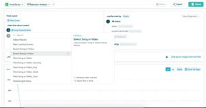
First, you pick ‘New User’ for First Event, then ‘Play Song’ for Returning Event and we get this pretty looking retention chart (from a sample Amplitude Project). And this particular one flattens out – a Product Manager’s dream!!!

Creating a New User Retention Chart
Retention Chart in Amplitude

But we don’t just want a pretty chart – you want something that helps you do your job better. As you can see, you can add definitions to your events and categorize them so everyone is on the same page. We’ve all been in situations where we misinterpret an event name and run an analysis that ends up being completely wrong.

Trust me, most Analytics companies don’t make charts that look this good or that are as easy to understand. Amplitude understands how user-experience differentiates its Product from others.

Giving Your Users a Super-Power

A framework I like to use to evaluate a product’s usefulness it to think about the ‘Super-Powers’ it gives its customers. So it’s asking yourself ‘What is that amazing thing my Product enables a customer to do?‘ Data is definitely something that Amplitude provides, but what it really excels at is providing Product Managers a framework for using that data. Two of the most useful frameworks I’ve gotten from Amplitude are Retention and North Star Metric.

Retention

As Product Managers we like to look at how many customers we have (DAUs, MAUs) and how many actions they perform (Audio/Video Stream, Social Posts), but these alone don’t tell us if we’ve created an enduring product. Amplitude – through their product, collateral and training – constantly pushes that retention is critical for true product growth.  Does your Product provide value to the customer such that they repeatedly come back to and engage with it? If this is the case, you have found Product/Market Fit! DAU and MAU growth will prove illusory if you just have new users that never come back to experience the core Product value. Viewing our Products through the lens of Retention make you think hard about whether your product has true value and if the features you’re adding are actually valuable.

North Star Metric

What are you and your team building towards? Is it the right thing and how do you know when you’ve reached your goal? Amplitude’s North Star Metric is a great framework for setting priorities and keeping your team headed in the right direction. A great North Star Metric consists of 2 parts:

1) A Statement of Your Product Vision and

2) A Metric that Serves as a Key Measure of Your Product Strategy

As an example, Amplitude’s Product Vision is to ‘Help companies build better products‘ and their North Star Metric is the # of Weekly Users for whom Amplitude has answered at least one question.

A North Star Metric should also align to customer value – so avoid things like DAUs and instead focusing on the actions that drive value. Defining a good North Star Metric will then align your team and company on the right things. And as Product Manager you can use it to force prioritization on all the requests you get from Management and Stakeholders. You have the ‘Super-Power’ of being able to articulate your Product’s North Star and this will bring credibility to you and your team.

Creating Better Product Managers

Amplitude’s vision is to ‘Help Companies Build Better Products’ and in doing so they are also creating better Product Managers. Observing how they’ve acquired, engaged and retained customers themselves, Amplitude  has given us a great example of how a Product-led Company operates.

What’s For Lunch?! (It’s MealPal)

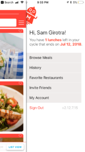
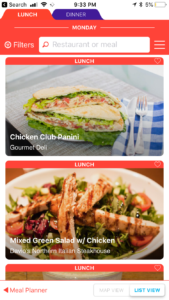
MealPal is a lunch and dinner subscription service where you receive a set number of meals for pickup over a 30-day period. Depending on your plan you can eat for as little as $6 per meal in New York City, which is quite a feat. I’m now on my second cycle and I’m not planning to leave anytime soon!

Annoying -> Fun

MealPal’s strength is turning something annoying (lunch, yes, extremely first-world problem) into something, well, fun! We’ve all been there – ‘time for lunch…but what should i eat today?! had Mexican last night don’t want it today…that place is too far..only have 30 minutes!’ With MealPal you get an email at 5pm every day telling you that the Kitchen is open for lunch the next day. You then pick what you want when you want it and you’re all set! So now you’ve solved lunch ahead of time and you have something to look forward to. The pick-up is the other annoyance in the lunch process, but MealPal even makes this delightful. Your order is ready when you arrive – no lines, no paying for anything – just show them your order number and you’re done!

Building Anticipation with Online x Offline

I really love the ~18 hours to payoff  as it’s  unique among digital experiences. We’re accustomed to instant gratification with social networks and news services, but the payoff only requires us to tap an icon on our home screens. There is an inherent anticipation build-up with Food Delivery services, but if it comes on time I’m simply satisfied and if it’s late I’m extremely hangry and nobody wins. MealPal promises me a trip out of the office at a specific time with little effort to accomplish my task of getting lunch – that is something I can look forward to with every meal from them.

After Lunch Experience 

Another great thing about MealPal is that there’s still more to experience after lunch. The next time I open the App after picking up my Meal I’m immediately prompted for feedback and I love this. It shows me that MealPal cares about my experience and wants to make the product better. The survey is short and to the point and I always complete it.


Suppliers

MealPal has done a great job with the Meal-eater experience, but they have another customer in the Restaurants that supply these meals. I was curious as to what the value proposition (other than exposure and foot-traffic) was to these Restaurants and found this from a great piece by GeekWire:

“MealPal is able to offer lower prices because it gives restaurants large orders for individual dishes in advance. It’s similar to a catering model, which Biggins said is typically the most profitable order for restaurants. MealPal lets many restaurants make more money per meal versus serving individual customers, she said.”

I have no idea what the logistics of working with MealPal are on the supplier end, but this economic arrangement seems very favorable. As good as the Meal-eater experience is, the supply of Restaurants is really the limiting factor to how popular it can become.

Making MealPal even better

While I love the service, there’s always room for improvement. Given how much I’ve used the service and the amount of feedback I’ve provided, MealPal should use those inputs to improve the experience for me. Sarah Tavel of Benchmark Capital calls this Accruing Benefits, which is basically  saying “The more I use this product the better it gets.” For example, I’ve noticed that when I go to select my next Meal the options have looked pretty static from week to week, even with consistent usage. This could be because they haven’t added many new restaurants, but my prior activity can used here to  give me an illusion of endless choice and keep me subscribed.  A couple ideas for this:

  • Suggestions – MealPal knows my taste profile, the places I’ve eaten and the places I haven’t tried yet; this would be a perfect opportunity for a suggestion
  • Popularity – They also know what’s popular among their customers so this would be a great option for a filter
  • 3rd-Party Data – I use other apps and services to find restaurant recommendations and having this layer on top of MealPal would help with discovery. I’d love to see a Foursquare integration (my go-to for reviews/ratings) so I could vet the places I’ve never been to before and maybe see my favorites/history from that service offered as suggestions in MealPal.

To MealPal’s credit I have noticed the addition of filtering by Portion Size, which is something they ask customers to answer in surveys. I find this feature very useful.

Look and Feel

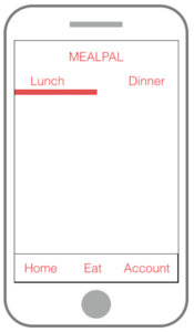
There are also a few things MealPal could do to improve the navigation of the app. I’m not feeling the hamburger menu and it’s position on the not-so top right still gets buried for me – even as an active user. I’d love to see the items in the hamburger as tabs on the bottom of the screen. If i want to see account settings  I have to 1)  tap the hamburger 2)  tap ‘My Account and then 3) tap hamburger  4) tap ‘Browse Meals’ just to get back to where I was. It’s not hard, but could be so much easier with tabs 🙂

And visually, I really dislike the ‘tabs’ used to distinguish between Lunch and Dinner on the home screen. They look like browser tabs and to me that just looks wrong on a Mobile App. A segmented control with the ability to swipe between the two sections would look a lot better.


I made a quick wireframe of how the structure of the app would look with these changes:


Try it for yourself

These minor shortcoming aside, I’m super-excited to see what’s next for MealPal and am very bullish on the service. And if you’re so inclined, sign up for yourself using my invite code: mealpal.com/samgirotra 🙂

Weekend Tech

How do you use tech on the weekend? A good weekend for me is one where time seems to move more slowly.  But given constantly updating feeds and news notifications using any tech on the weekend feels chaotic. I try to follow the philosophy that no tech is the best tech, but it’s not practical to stay away completely.

So I end up changing how I use tech on the weekend compared to how I use it on weekdays – both in terms of which apps and services I use and how often I use them. And I find that my weekends are better because of this.

No Social

  •  Twitter: it represents most of my social media consumption and I find that cutting it out on the weekend lets me focus on the weekend.  Twitter is hilarious, informative and educational, but looking at it makes my brain feel as if it’s in perpetual Fast-Forward. I don’t mind this during the week since I’m already in overdrive for work, but looking out my window on a Sunday puts me in a better mood than looking at Twitter does.
  • Instagram: it’s my number two social media app and it doesn’t put my mind in overdrive quite like Twitter does. But, for me at least, it can swallow up a lot of time before I even realize. Scrolling through photos of my friends, favorite artists and athletes is a lot of fun, but before I know it 45 minutes have passed and I’m not even sure whose photos I’m viewing anymore. This isn’t necessarily a bad thing! Getting lost in something and not feeling the need to be constantly productive is very liberating. But I let it get excessive to the point where it’s not even fun so I just cut it out on the weekends.

Non-Social Substitutes

If I can’t avoid tech, there are some apps that are better for my weekend mindset and help me maintain peak-chill.

  • Apple News: I wrote about it at length – Apple News is a go-to when I’m hankering for news and gratification that an infinite scroll brings…without all the noise.
  • Pocket: I also wrote about Pocket and it’s perfect for the weekend when I have some time to catch up on long reads I’ve saved. I’m in rapid information-processing mode on weekdays, but on the weekend I have time to dig into things and Pocket lets me do this with articles.

Off the Grid

Sometimes you just have to put your phone in the other room and go it alone. I find old-fashioned newspapers perfect for the weekends where I have free time and want some light entertainment.

  • NYT/WSJ Weekend Edition: At $5-$6 per paper, this may seem like a lot to spend, but have you seen how big these editions are? There’s gotta be at least 3 hours of entertainment in these papers and I never regret my purchase.

So how do you use tech on the weekend? Does your app usage change from the weekday to the weekend?